Blending the 2017 colour of the year
For the lovers of home interior décor and wall papers, greenery will fill your lives, home and environment with hope and strength to move on to new beginnings just as the popular saying goes, “Let’s go green.”
Pantone colour institute predicts a new year filled with hope and has recently named greenery or bright green as the 2017 colour of the year. “Greenery bursts forth in 2017 to provide us with the reassurance we yearn for amid tumultuous social and political environment,” the executive director of Pantone, Leatrice Eiseman said.
What is greenery?
Greenery is a colour that comes in between yellow and green which makes it stunningly bright hence bright green. It is calming, stress relieving and enhances creative minds at work as it is a representation of freshness, prosperity and progress.


What types are available?
It is available in yellow grey green, apple green, forest green, lawn green, spring bud, Kelly green, Islamic green which can complement a mosque, neon green and lime green which is vibrant and lively.
The Sadolin paint technician at hardware world Ntinda, Ronnie Angalla took us through a few available greenery types which include lollipop and lime green which are vibrant and lively.
Where can it be placed and what does it go with?
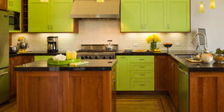
Angalla says, “It is suitably used on the kitchen wall or cabinet with a mixture of purple bar stools, dining room chairs with a mixture of purple wall paper.
It can also be placed in the bedroom on the wall paper with a mixture of light blue covers and yellow chair pillows which is suitable for a girl’s bedroom. “Bright colours sharpen a child’s thinking and intelligence.”
Tips on how to use greenery?
Pantone’s 2017 colour can be used in different ways though very dangerous if wrongly placed. Angalla says greenery is very bright and delicate if mishandled in the kitchen with charcoal smearing and smoke.
“You can place green on your living room corrals and blended together with orange or any other bright colours such as yellow,” he adds.
In order for you to understand which colour best suits your home or which colours to blend together, you ought to order fabric swatches from your interior designer. Green can blend with purple, yellow and light blue.
The 2017 colour can be applied on room walls or incorporated in curtains, chandeliers, furniture, vases, pillows and covers.
Avoid too much of the green and if the above ideas do not work for you, try to get potted green plants for your living room but ensure that they are not too large to cover the window.
What are the pros and cons?
Greenery could be associated with some negative influences that can distract one’s mood such as the yellow grey green that makes one feel dull and unpleasant.
Eisemansays, “Greenery is symbolic of new beginnings thus giving a room a fresh feel every time you step in it.
Applying
Green comes in such versatile hues, shades and values that the choices on hand are abundant and at times even overwhelming. With the color being such an integral part of nature, we also tend to accept it far more easily as part of our home than many other secondary shades. Here are a few gorgeous and sparkling inspirations that should help you make a choice on using the appropriate shade of green as an accent hue.
While using green in the form of an accent wall is not all that common, there are other ways in which you can bring the colour forward. Accent fabrics are an easy and aesthetic option in this regard. The couch cushion, lovely light green drapes, a picture frame are good ways of using it.