Use colours to create an effect
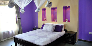
Colours such as purple and yellow if used in calm shades can create a calming and relaxing effect in a room. Photo by Rachel Ajwang
What you need to know:
To choose a colour for a specific room in the house, there are a number to choose from depending on the effect you create, Pauline Bangirana writes
Initially, most houses would be painted in cream, white and a black skirting. However, things have changed and it depends on the paint, your wardrobe, purpose and sense of style you want to create in a particular room, John Meddie Segane, an interior designer notes. Some of the common colours that are used to paint house interiors moving to a deep grey and red.
This is evidence that when people are painting their houses, they do not only consider just paint but rather concentrate on colour and carefully select shades to suit the various rooms in the house. This is because colours can become a lifestyle since it can create a different feel to a room; which solely depends on the colours you select to paint your walls. These will go as far as determining your mood.
Considerations before choosing a colour
Shrinal Patel, head interior designer, Crown Paints Kenya, notes that for anyone that has an interest in colour and design, you will be fascinated by colour psychology.


Patel notes that before choosing a paint, you should have important considerations. These include the use of the room, the people who will use the room, its size and how often it will be in use. “If the room is for relaxing, say the living room, decorating it entirely in red, with red curtains and furniture would be inappropriate.” This is because red is a dramatic colour especially when used in large dozes, Segane explains.
RED

Red is the most powerful colour on the hue wheel. It is the colour of fire and passion, and it represents our desires and cravings.
She explains that red has been shown to stimulate the appetite and conversation, hence, interior designers suggest it for dining rooms (if you are on a diet, perhaps you could try blue instead).
Being the hottest colour of the spectrum, red can bring warmth and coziness, and is ideal for people susceptible to cold.
However, Resty Nakirya, an interior designer at Design Initiates says it may be perceived as a stressful colour known to increase heart rate and blood pressure. “It should not be recommended where calmness and clear thinking is required in places such as the study.”
Patel says its energetic frequency is not conducive for areas where rest is needed, such as bedrooms or relaxation areas.
As with other colours, “the psychological effects of the colour red depend very much on its intensity. So, while vibrant, saturated hues of red have been shown to raise people’s heart rate and blood pressure, you might feel quite comfortable with muted, warm, earthy shades of red, for example: red ochre, venetian or brick red because these shades depict warmth, comfort and energy. This is opposed to an exaggerated pulse,” Patel explains.
PURPLE
This is the colour of true greatness, and is associated with inspired leadership.
Purple is a positive inspirational colour and is a good choice for creative people particularly those that require solitude for inspiration, such as musical composers, poets, painters and sculptures.
Although it requires careful handling in interiors, purple is a striking colour.
It is the perfect colour for meditation areas or relaxation rooms as it connects the mind, body and spirit.
Suzan Kintu, a business woman explains that she used a calm purple shade in the master bedroom because, “The designer told me purples can be calming.”
YELLOW

Yellow is seen as an optimistic colour, and has a unique ability to raise the spirits and inject vitality. It is the colour of sunshine and happiness.
It is strongly connected with creative energy but overuse can suggest a disturbed mind. It creates a warm first impression thus, it is a good choice for entrance halls.
Yellow is a favourite for kitchens, as it sets the mood for the rest of the day and helps with creativity and creates conversation. It is thus a good choice for children’s bedrooms as this helps to stimulate their creativity.
Patel explains that a tint of yellow on walls or ceiling can add brightness to a room, while saturated, intense yellows might make you feel cranky after a while. Yellow makes for great “highlights”. You could use smaller doses of it in accessories, flowers, or pictures to brighten up darker areas and make them bright.Patel notes that opinions about colours are divided, “I suggest you do not worry too much about how the colour affects others - unless you share a home with them, of course.”
Consider your reactions to certain colours; this will help you determine which colour suites your home or a particular room. Patel notes that there are ways of utilising colour and these can be implemented into your home. Segane suggests that yellow can be used in kitchens since it helps quickly warm up a cold room. it also energises a room.
BLUE
The positive characteristics of blue are that it creates a serene atmosphere due to its calm restful nature. It can act as a potent sedative, making it ideal for anyone with insomnia. So, blue is an ideal colour for bedrooms or restrooms or in any area where you want to bring about calmness.
Suzan Kintu, a business woman who used this colour in her son’s room, says an interior designer told her the colour is suitable for children’s rooms.
“Blue is a good choice for kitchens and bathrooms as well. You can tone it up with yellow as this helps create a certain relief,” Segane says.
However, Patel further explains, “just like the sea, blue can be calm and peaceful one minute, yet rocky and turbulent the next making it prone to moodiness; hence not making it a very sociable colour.”
“It should be avoided by anyone that suffers from depression or sadness and those people who do not like cold weather. It might be recommended in the kitchen or dining room,” she says.
GREEN

Green is the colour of nature and represents balance and harmony.
It is a healing, soothing colour which can be used to create a relaxing area in any part of the home.
However, it may not be the best choice for the dining area. One way to use green in interior design is to combine different hues of it, or combine it with other colours: Sage, grey, pink and magenta go well it. You can combine greens with neutrals and blues for a calm look.
Patel explains, “Alternatively, you could try mixing a tiny bit of the complementary colour, red, into your green paint. That mutes it slightly and adds complexity and depth.”
You could tint it with white or light grey, or discolour it with some yellow or blue: these are all ways to utilise the psychological effects of green while avoiding the decorating pitfalls.” She adds.
Lighting influences any colour in interior design - colours change their ‘personality’ under different lights. So, it’s really important that you test any green paint you want to use thoroughly in every possible daylight situation and under artificial lighting.