Blue and brown make a perfect match
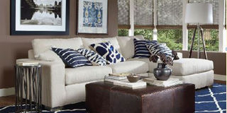
DECOR. Blue being a fresh, calm, cold colour can be matched with brown to tone it down to creates a feeling of warmth into the space. Courtesy photo
What you need to know:
- DECOR. Blue being a fresh, calm, cold colour can be matched with brown to tone it down to creates a feeling of warmth into the space, writes Gloria Kawuma.
I dared use blue curtains and some throw cushions in a basically brown-themed office lounge and there was an uproar from some of the staff.
Apparently, they believe blue and brown don’t match at all. I should have gone with beige, coffee brown or even something with gold in it but not blue.
If two of the top bosses had not intervened, I would be sent back to the shops again to purchase any shade of brown available.
For many years, the order was to match a colour with different shades of the same in order to create a perfect theme.
But thanks to the fashion industry for introducing the trend of wearing bold contrasting colours, what the street call colour clashing.
Few brave and adventurous people have taken this movement on while the others have opted to stay in the shadows and play it safe by sticking to matching any colour with either white or black.

The brown colour possesses earthly tones that are warm and when matched with the right colours, they can be cozy and inspiring.
Brown is often referred to as bland, monotonous and uninspiring and dull in both the interior design and fashion industry.
But in Uganda, it is popular because like black, it hides a multitude of dust and dirty sins. However, when combined with the right shades it can be lustrous, creating a modern and sleek look.
One of those colours is blue. Blue being a fresh, calm, cold colour can be matched with brown to tone it down and when reversed brown is paired with blue, it creates a feeling of warmth into the space.
Another shade of blue that can be considered is turquoise. It is a colour between blue and green. The secret of how it works is in the colour ingredients used to arrive at a particular colour.
For example, to get colour orange one has to mix two primary colours yellow and red. To generate colour brown, one has to mix yellow, red and a dash of blue.
Also, the position in which the colours appear on the colour wheel matters. The colours that are opposite each other are referred to as contrasting colours.
Once such colours are paired up with consideration to the tones in each, you will be amazed by perfect matches created. Be daring. Forget the conventional colour matching when buying curtains and cushions.