There is no gain in pain trying to read newspaper
Since the redesign of Daily Monitor was unveiled early June, I have received a number of complaints from readers about the legibility of some of the stories, particularly in the Op-ed section of the newspaper.
One of the complaints by a reader went thus: “Good morning. Is it possible to increase the font size of the letters for the opinion articles? The font [size] used in The East African newspaper is, I believe, preferable for most of your readers. Thanks.”
I shared this feedback with the editors.
Weeks later, this reader returned with another message: “Good morning. Re: Page 15 of Daily Monitor of July 7, 2020. Are we back to the good old days when there were only 2 opinion per page instead of 3? In my view, it is a better and preferable option.”


Many readers have called to make the same point, the latest coming on Wednesday morning when a reader called to say the Op-ed articles cannot be read by older people of 40 and above who have challenges with their eyesight.
“This is for young people,” he said, adding: “It is us the older generation that like to read these columns, and the newspaper in general”. I promised to bring up the matter with the concerned editors again.
I asked Muhammad Tamale, Daily Monitor’s Data & Visualisation Editor, what the font size of the Op-ed pages is and why readers were having challenges with legibility. He responded: “The text font size is 8.7, with 9.8 spacing (locked to grid). That is sufficient for a comfortable read by an average eye. However, violation of design rules has constantly affected legibility of some stories, and in some cases entire pages where the editors reduced the tracking (spacing between letters) by -20 points (negative twenty points).”
The challenge readers have expressed, therefore, belongs to the realm of typography, to which I was introduced many years ago by veteran British editor and newspaper designer, Bob James.
In simple terms, “typography is the art of arranging letters and text in a way that makes the copy legible, clear, and visually appealing to the reader. Typography involves font style, appearance, and structure. Typography should guide and inform your users, optimise readability and accessibility, and ensure an excellent user experience.
Good typography could be the difference between someone staying on your website [text] for one minute or half an hour.” – Jaye Hannah, What Is Typography, And Why Is It Important? A Beginner’s Guide.
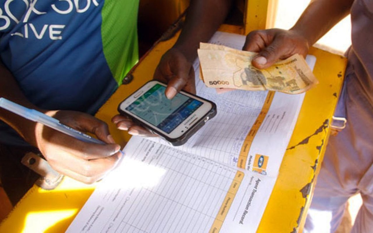
It is clear the challenge the Op-Ed editors are grappling with is how to fit three opinion articles on one page, each article being between 650 and 700 words. Previously, two articles were published in the same space.
So the editor has three options: 1) only process short articles, depth of argument notwithstanding; 2), mutilate the articles to the point the arguments are lost or disjointed; 3), technically “cheat” a little by reducing space between letters and the font size if need be.
With the editor “home and dry” and everyone happy that more opinion articles are being published, the problem is pushed to the readers who have to squint their eyes to try and read the three articles on a page.
It should be noted that the human eye reads by recognising the shapes of the top of letters/typefaces and attached serifs (extensions). When the typefaces are small and squeezed, the eye has to labour a little more to differentiate the letters or pick out the extensions. Considering that reading (except for examinable or academic purposes) is mostly voluntary, many readers will simply flip to the next page, or next paper as there is no gain in pain. So in the end, the three articles will hardly get read except by a few that are persistent and have no challenges with their eyesight.
I shall end with a quote about clarity of content/stories that I came across recently and shared with the editors on July 16. It says: “Readers are not going to pay for content if they feel like they are doing all the work in the relationship… By removing barriers to understanding, removing barriers to usability, we make the product more valuable. Journalism is only half of the product; the user experience and the journey around the journalism is the other half of the product, and that’s what we need to work on.” – Damon Kiesow, Poynter Institute.
Send your feedback/complaints to
[email protected] or
call/text on +256 776 500725.